Slide 1: Original Slide 1: Re-design

Slide 2: Original
|
Slide 2: Re-design
|

|

|
Reflection
I used to use a lot of PowerPoint presentations in my lessons. After a few years, I found myself ditching my slides for more interactive tools like ActiveInspire and sites like smore.com. However, I still appreciate a good PowerPoint presentation. One of my pet peeves is when too much information is presented on one slide and, especially, when that information is read to me. I am also not a fan of bad clip art and animated text. When executed correctly, PowerPoint certainly still serves as a great visual in a lesson or in any presentation.
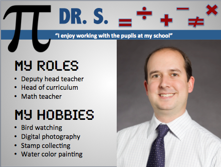
I chose to redesign the “Dr. S.” slide and the Mount Abu slides. In the original Dr. S. slide, I found it hard to determine if Dr. S. was an elementary, middle or high school teacher. His slide looked very elementary but his roles seemed to fit that of a high school teacher. I did not enjoy the color combination of the yellow text on the purple and pink background. I also didn’t like the clip art and that the three graphics didn’t match in their look. The picture of the teacher was also of poor quality. Finally, the layout was not ideal.
In my redesign, I employed the following multimedia principles:
In the original Mount Abu slide, there was way too much information on the slide. That slide alone could be split up into 2 or 3 different slides. Additionally, the text is far too small, especially with the yellow font contrasted against the bright blue background.
In my redesign, I used the following multimedia principles:
In my opinion, if a PowerPoint presentation is done well, it supports dual coding because a verbal presentation is supported by a well-executed visual. The students will benefit from listening to a presentation while having a simple, yet aesthetically- pleasing visual to reference.
I chose to redesign the “Dr. S.” slide and the Mount Abu slides. In the original Dr. S. slide, I found it hard to determine if Dr. S. was an elementary, middle or high school teacher. His slide looked very elementary but his roles seemed to fit that of a high school teacher. I did not enjoy the color combination of the yellow text on the purple and pink background. I also didn’t like the clip art and that the three graphics didn’t match in their look. The picture of the teacher was also of poor quality. Finally, the layout was not ideal.
In my redesign, I employed the following multimedia principles:
- Coherance Principle: I shortened the bullet points, eliminating any extraneous text. I also broke them into categories.
- Multimedia Principle: I eliminated the quirky graphics and chose math symbols to highlight the fact that he is a math teacher as well as simplify the look of the slide.
In the original Mount Abu slide, there was way too much information on the slide. That slide alone could be split up into 2 or 3 different slides. Additionally, the text is far too small, especially with the yellow font contrasted against the bright blue background.
In my redesign, I used the following multimedia principles:
- Coherance Principle: I eliminated a lot of the text by deciding to focus on the Wildlife Sanctuary. By eliminating information, the slide is more effective and easier to read. The information I left out could be included on additional slides, if needed.
- Signaling Principle: The clipart I selected highlights the two sections under “wildlife sanctuary.” It lets the viewer immediately see that there is information about animals and plants. This also illustrates dual coding in that an image is associated with a word.
In my opinion, if a PowerPoint presentation is done well, it supports dual coding because a verbal presentation is supported by a well-executed visual. The students will benefit from listening to a presentation while having a simple, yet aesthetically- pleasing visual to reference.
